April already! Time goes by way too fast. So I picked up
this magazine simply because the cover really caught my attention. Everyone has
a preferred colour, but when I see purple, automatically my eyes see nothing
else. So yes, the purple font on the cover engaged me. Plus the title
of this month’s magazine is called ‘Perfection with pastels’ and last month I
did a post on pastel colours and how it is related to spring, so I really wanted
to hear what others had to say about it.

Read More...
One of the first articles that I was interested in was called 'In the News'. This is a round- up of the latest design news and vintage-
inspired home wares that the editors have come across. They spoke about
statement walls- Now I adore statement walls simply because they make such a
difference to any room, from a beautiful dining room to just a small guest
bathroom. I will be doing a post on statement walls soon.
Speaking of walls, I
was watching ‘The Real housewives of New York City’ and there was a showroom
charity event where a huge house was rented, and designers from all over New
York were given the opportunity to design a room each. It was not mentioned how
money was raised, but maybe through ticket sales or a percentage
of what was sold. I thought that was such a good idea, and would love to
either take part or host something like this. In the home they came across removable wall
paper, which can be repositioned, re- used and of course removed without losing
adhering qualities. I thought this was a fantastic idea for university dorms.
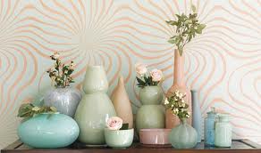
‘In the News’ also spoke about gorgeous glass, and how soft
pastel shades of glass placed around your home would really add
that ‘spring touch’. By glass this could mean a vase or a bowl,
just for decorating purposes.
Period Homes and Interiors mentioned that feathers are
extremely popular this spring. Here are a few things that were found, what do
you think?
 |
| Star by Julien Macdonald Stylish black feather Lamp- Debenhams |
 |
| White Feathers Wall Clock by Karlsson |
 |
| Nickel- Plated set of salad servers with gold coloured feather handles- Oliver Bonas |
The magazine included a Huge segment called Pretty Pastels. The writer expressed their view on pastel colours and how it
has depth and substance and how it can be contrasted with dramatic and
striking shades like black which gives off a 1950’s vibe.
The pinks and lilac shades of pastel colours give off a feminine feel
 |
| Pastel Design Included in the magazine Other Pastel Rooms |
 |
 |
I really loved this magazine. It is informative, clear with
fantastic designs!
Lots of Love
Alexis Romeo xxx


No comments:
Post a Comment